On Broadway
CASE STUDY / EXPERIENTIAL DESIGN / BRANDING
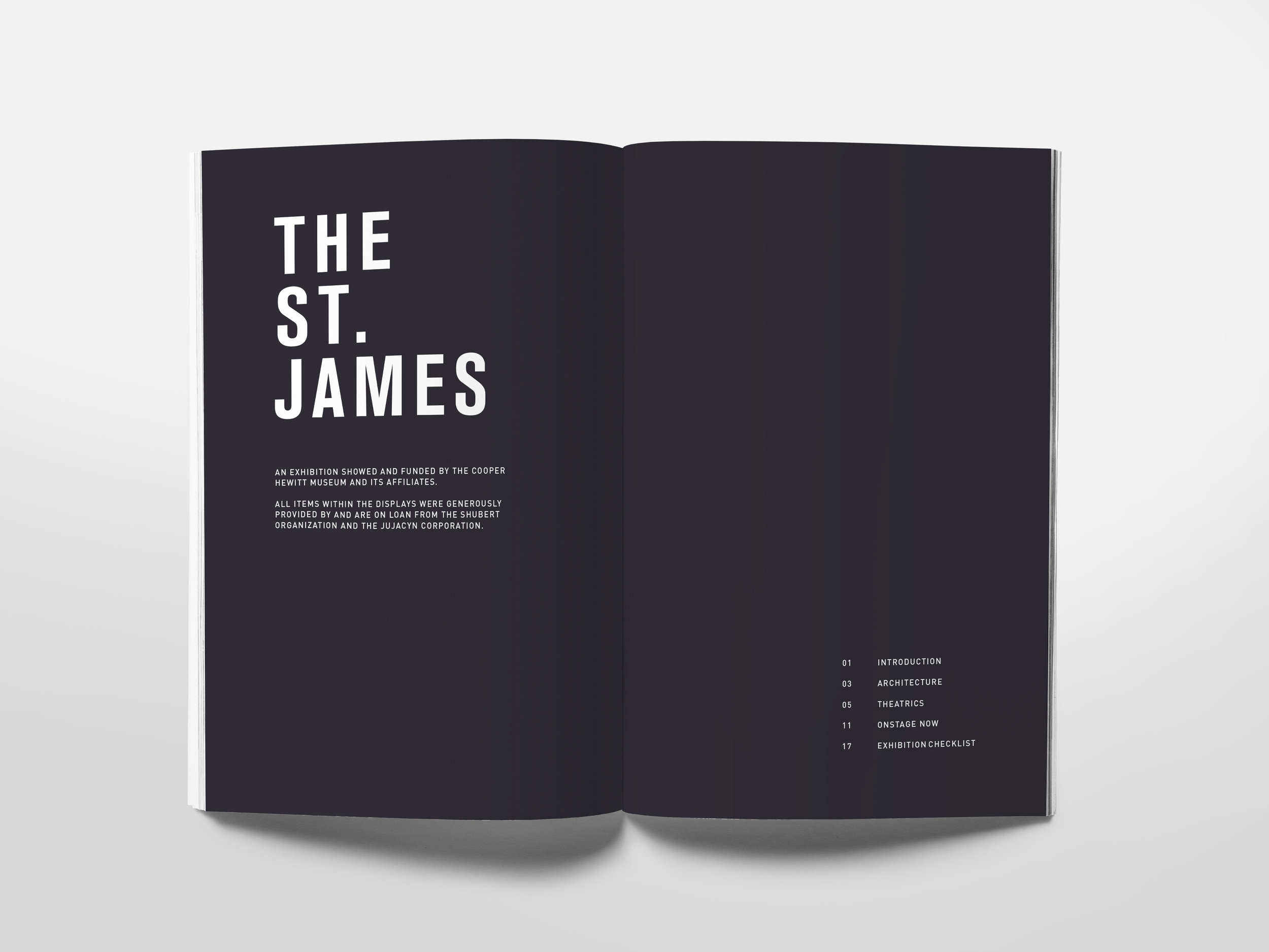
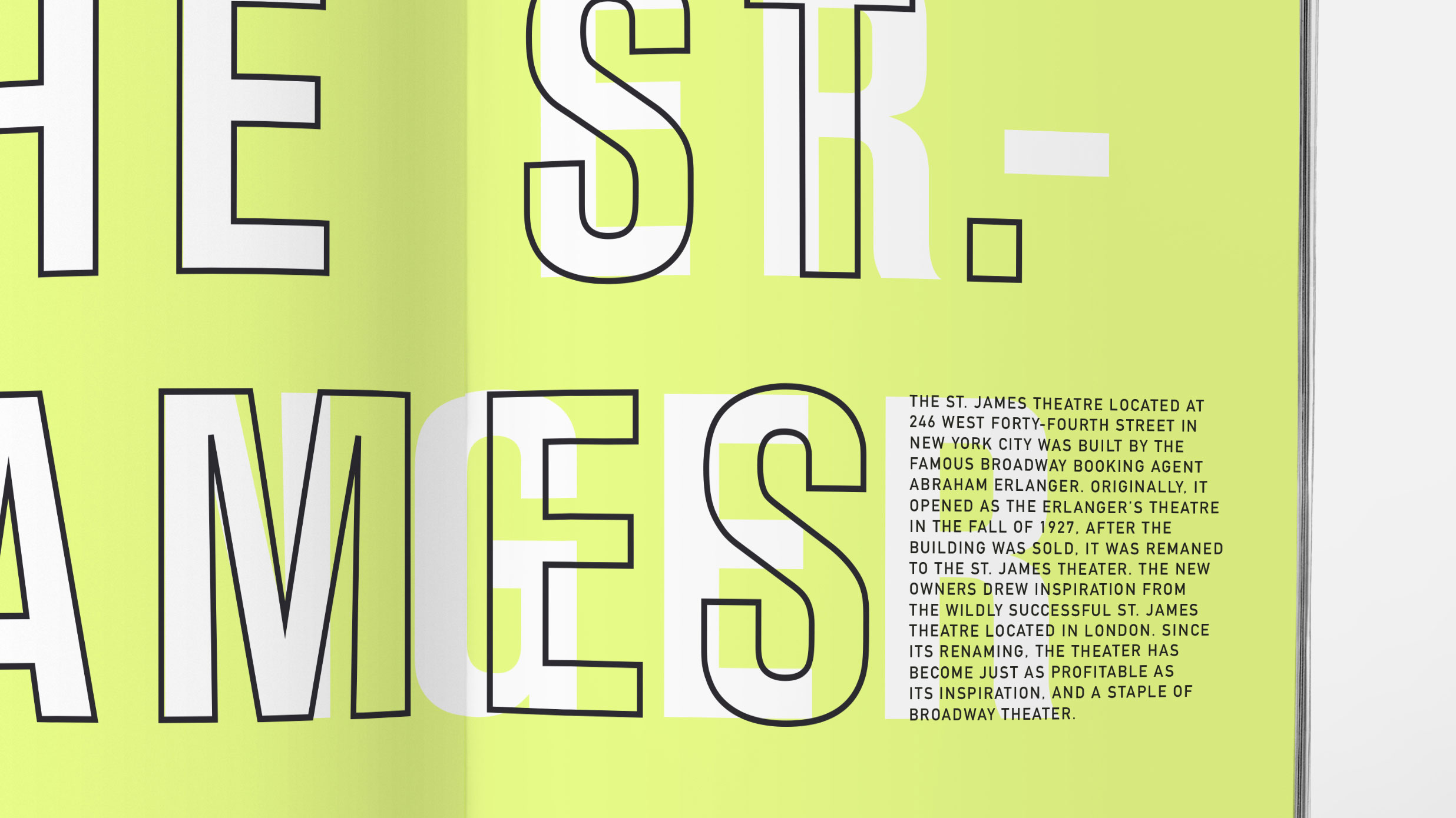
A museum exhibition shown at the Cooper Hewitt Museum entitled, “On Broadway.” The exhibit highlights the rich histories of Broadway theaters in New York City: their interiors, their pasts, their present. Featured theaters include the St. James Theater, the Imperial Theater, and the Lyceum Theater. The project encompasses a series of catalogs, print advertisements, and a website.

ON BROADWAY
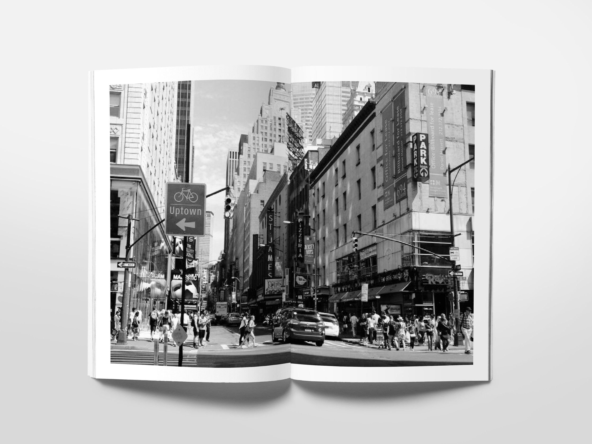
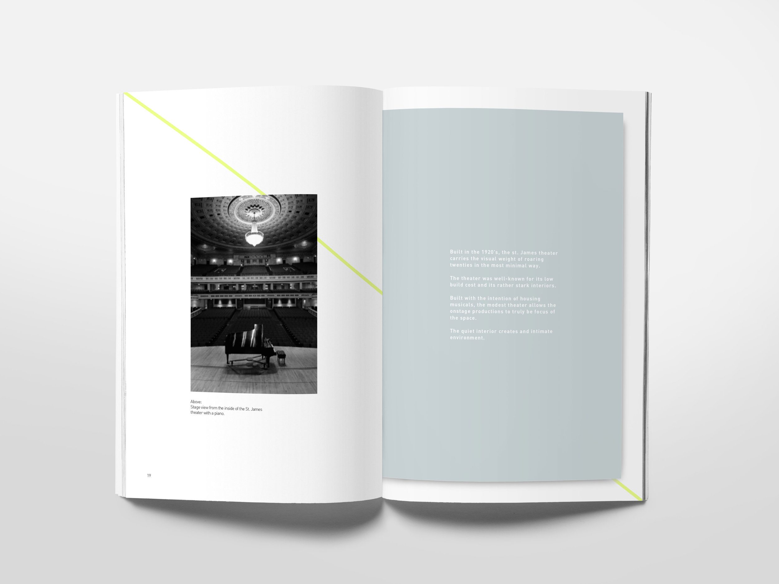
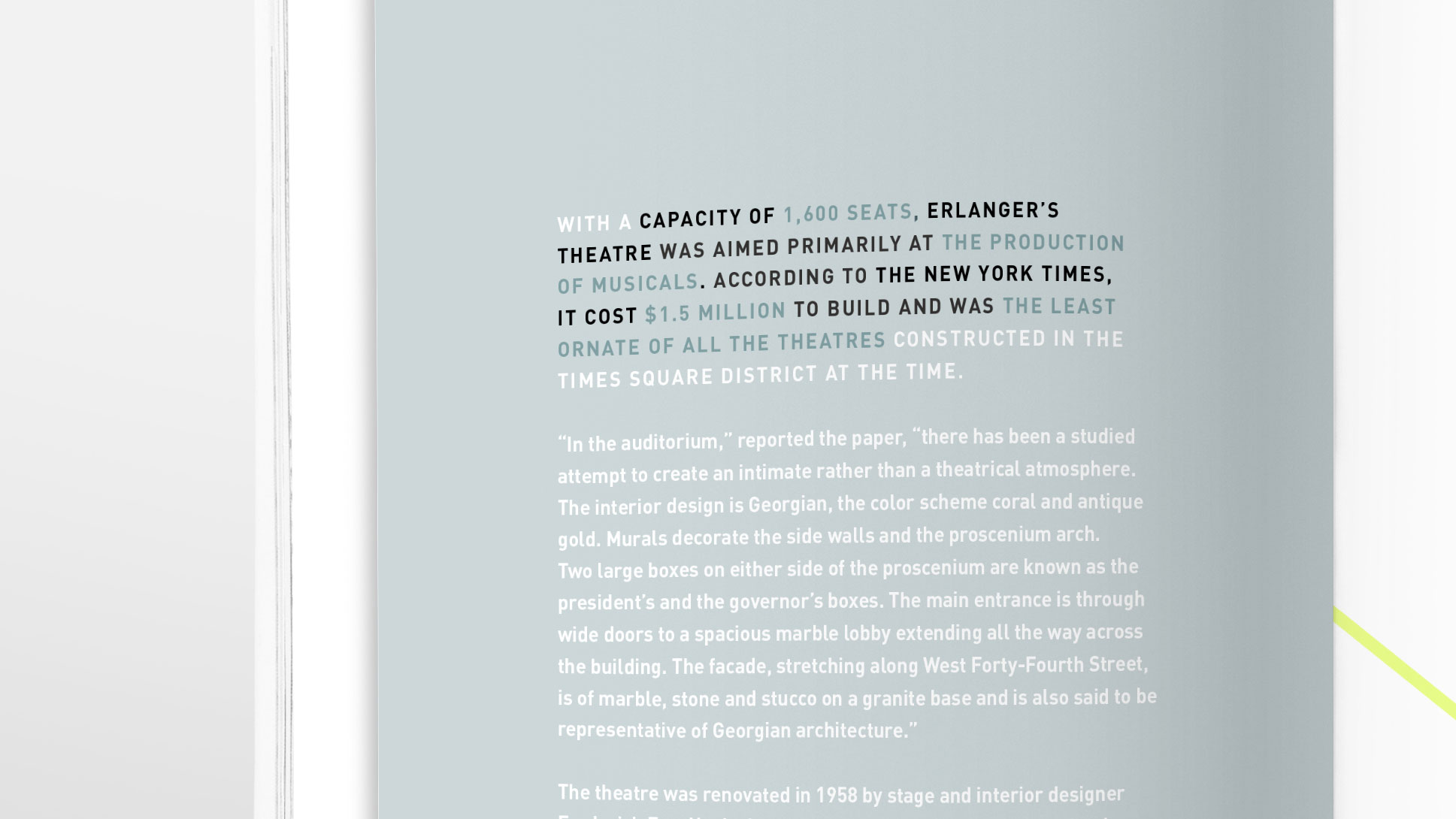
A Broadway show is a spectacle that everyone should experience at least once in their lifetime. A large part of the Broadway experience, other than the show, is the moments spent in the theaters before a show starts. Eyes opened wide in awe at the stunning architecture and dizzying height. This exhibition at the Cooper Hewitt Museum strives to highlight the architecture and outline the history of iconic Broadway Playhouses and Theaters.

TARGET AUDIENCE / BRAND DEVELOPMENT
The target audience for this exhibition is young adults and older, specifically those with an interest in the theater. The branding of the exhibition uses bold images, large type, and bright colors, emulating the spectacle of a Broadway show without falling into the stereotypical imagery that surrounds theater. The brand leans towards simple forms and solid colors, allowing the images to create movement and curves throughout the brand.

CHRONOLOGICAL EXPERIENCE
A large consideration that was kept in mind while developing this brand was the order in which the public would most likely encounter and experience this brand. Meaning, being smart about what the public would see first, keeping in mind what elements would need change per different pieces of collateral. Most likely, the viewers would see a large advertisement of some sort. Maybe this is a bus stop poster or a building side billboard. Maybe they picked up a postcard advertisement and then they were encouraged to look for more information by going to the Cooper Hewitt’s website.

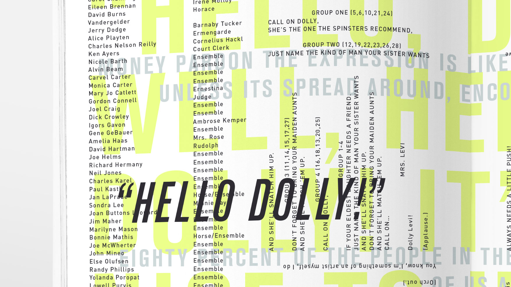
MUSEUM WALL GRAPHICS
Keeping the brand consistent in the museum wall graphics was a challenge. Using bold type and bright colors while keeping the content readable was difficult, but through efficient type systems and smart color usage, the brand was maintained and expanded.


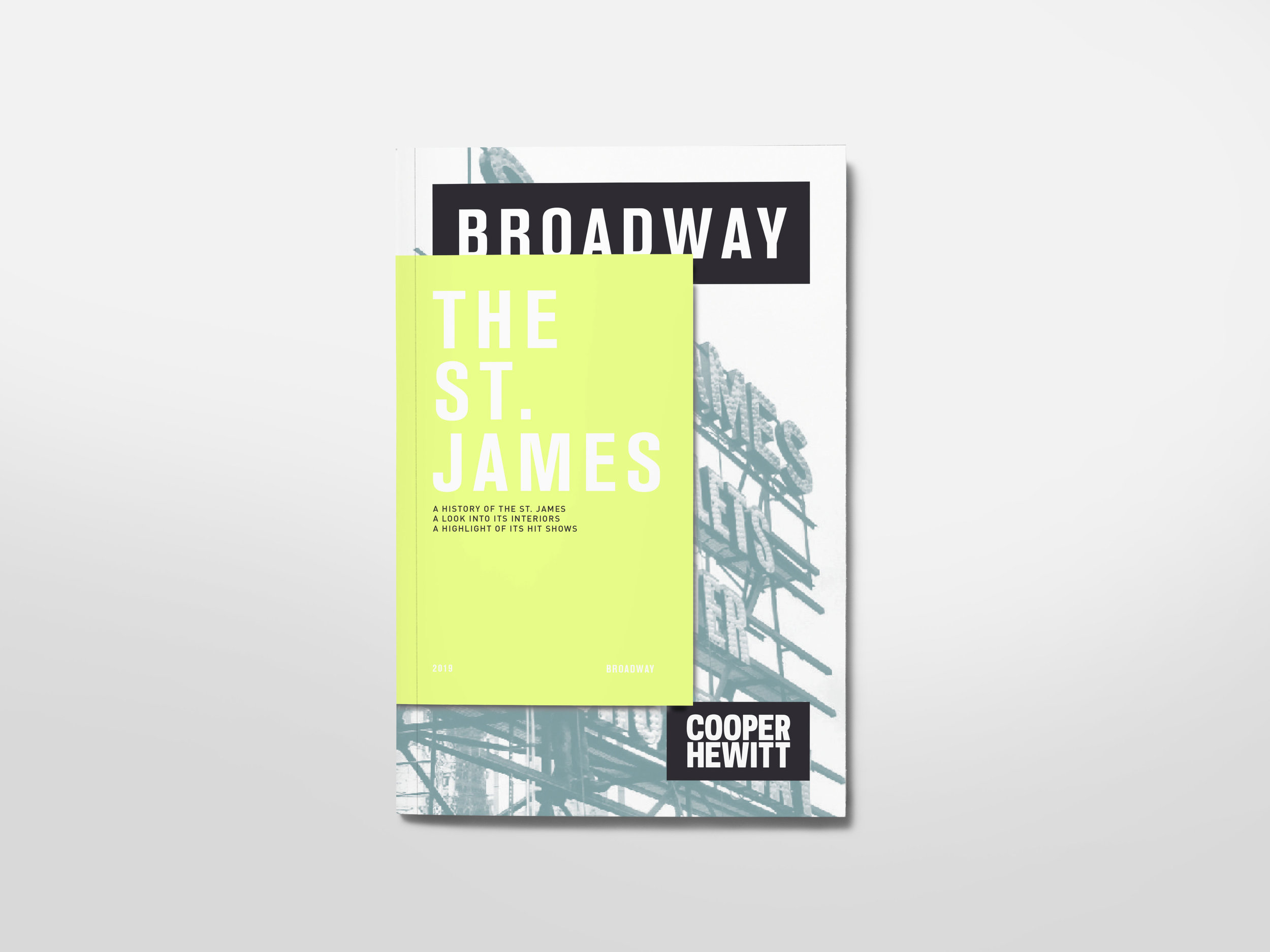
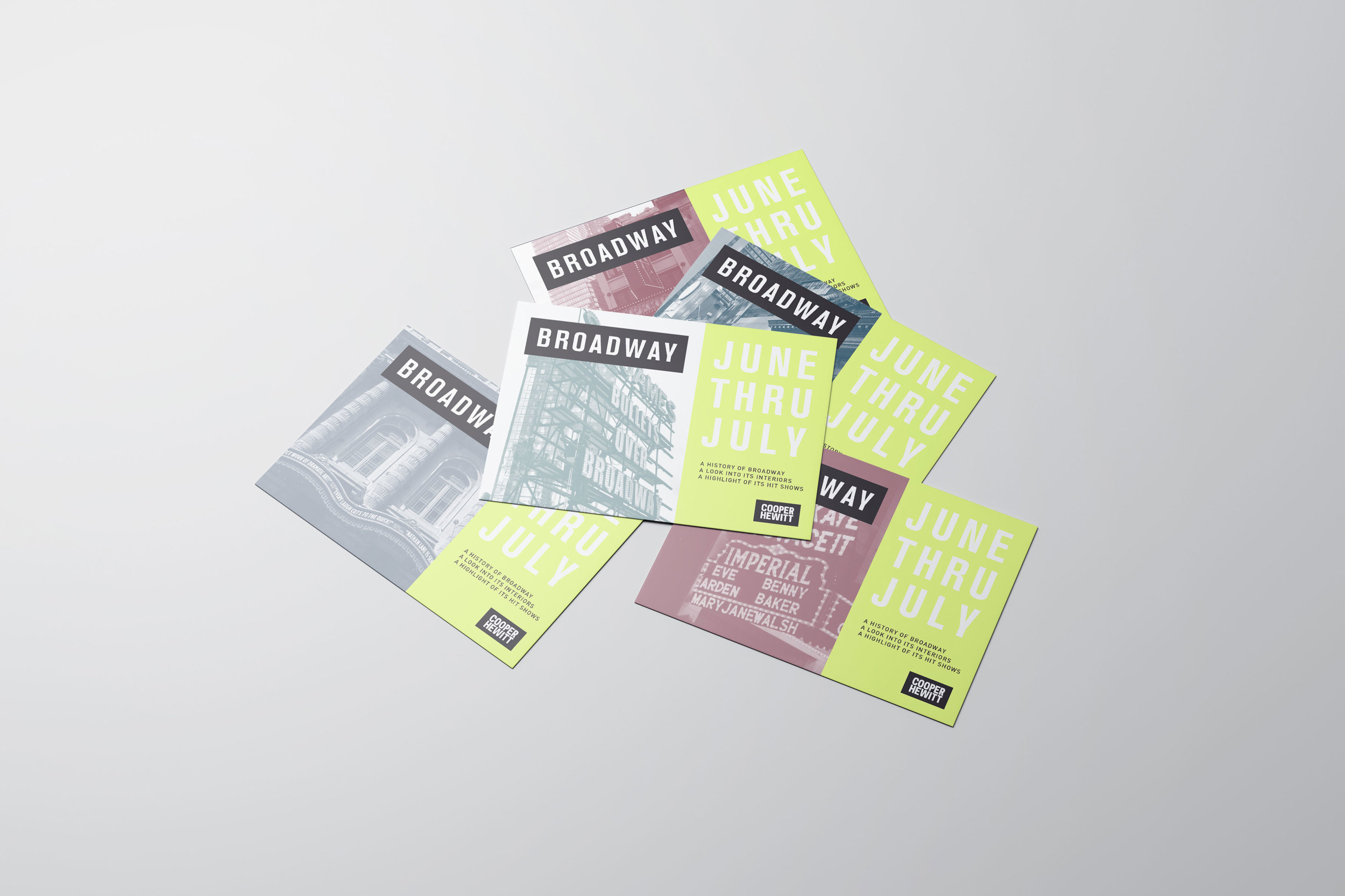
EXHIBITION CATALOg / DISPOSABLE V. KEEPSAKE
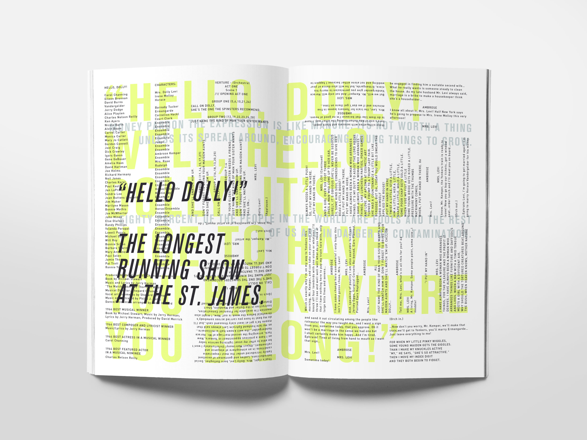
It was important to the concept that the exhibition catalog felt like a Playbill. It was also great opportunity to play with a unique form. However,The problem of disposable he was encountered when building the playbill form. Playbills are pieces of print collateral that are meant to be thrown away and disposed of, however, museum exhibition catalogs are something that people hold onto for decades. So, the design challenge became making a form that is inherently disposable into something that someone wants to hold onto and keep for a long time.


VALUE THROUGH UNIQUE FORMS
By combining the light weight paper and staple binding with interesting tab-in usage and graphic spreads, the problem of disposability was solved and the iconic form of the Playbill remained intact. This is a catalog series that provides information on the theaters and pieces highlighted in the exhibition.